Crescent City Film Festival Brand Refresh
Kristen Goodly
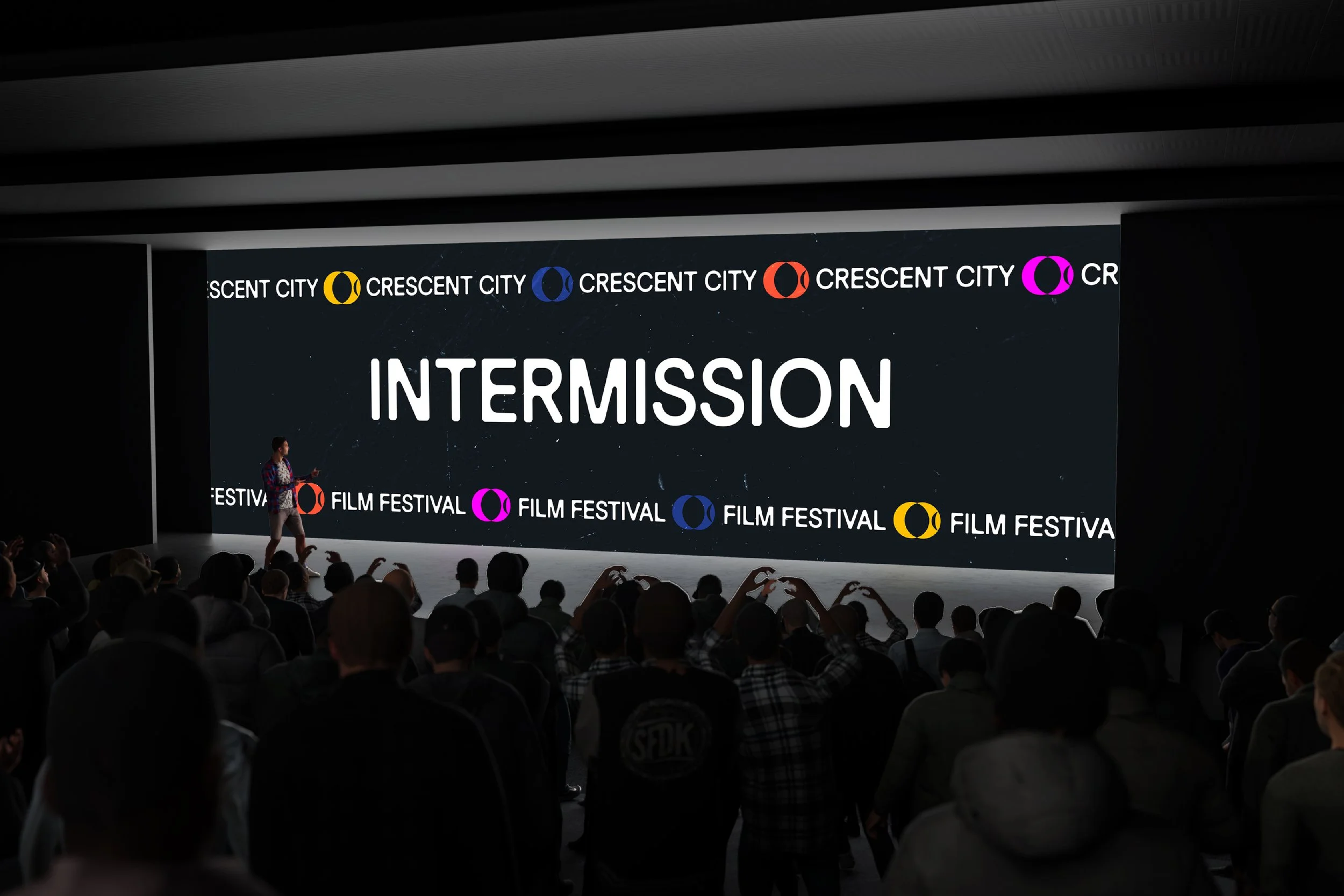
Crescent City Film Festival Rebrand reimagines Loyola’s student-run festival to address its low visibility and inconsistent identity. While the event reflects strong creative work, it has struggled to establish a recognizable presence within both the university and the broader film community.
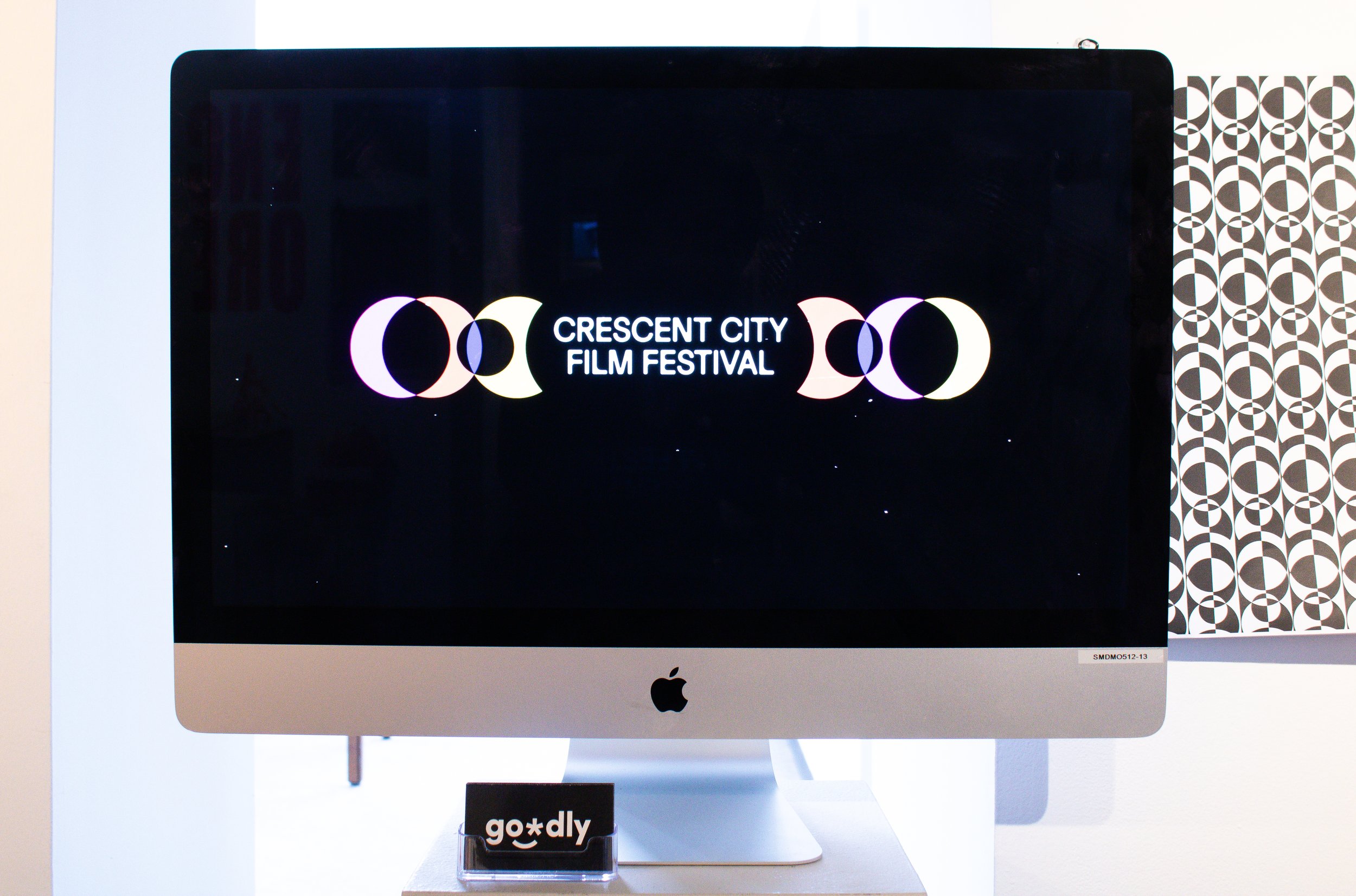
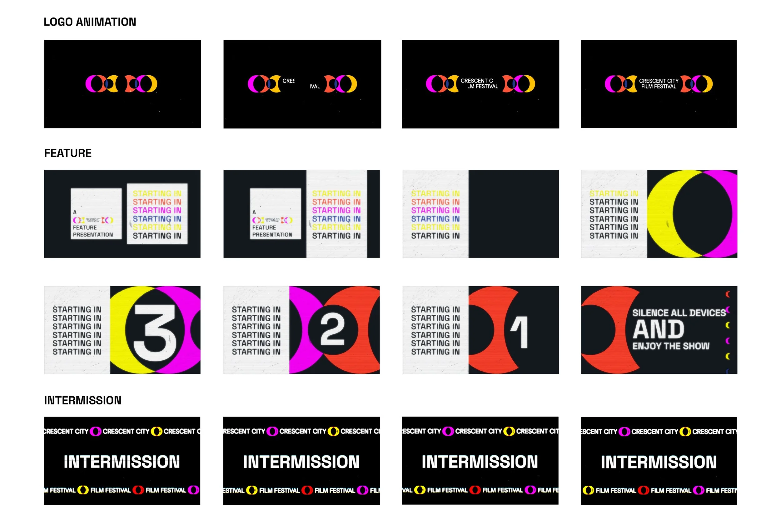
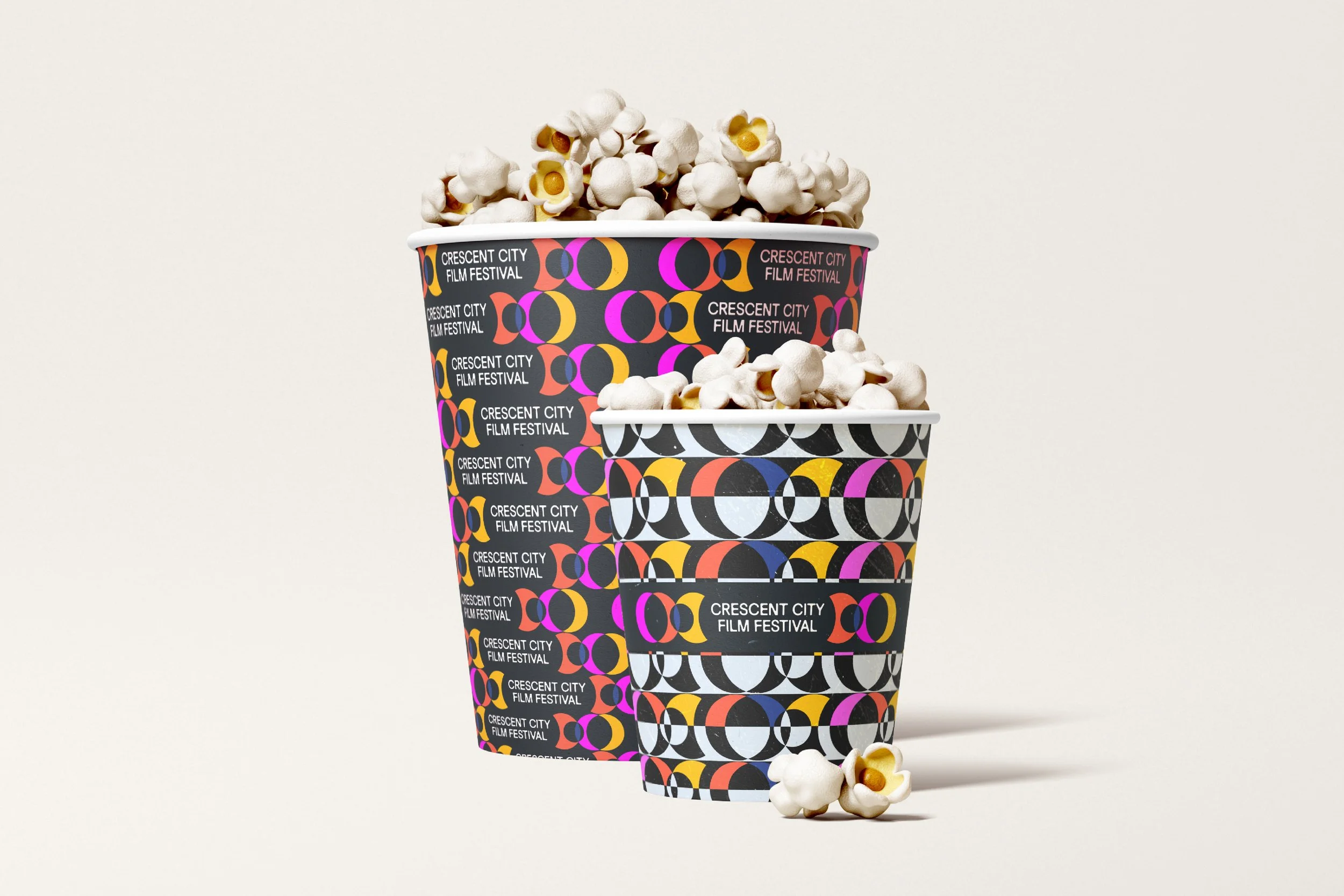
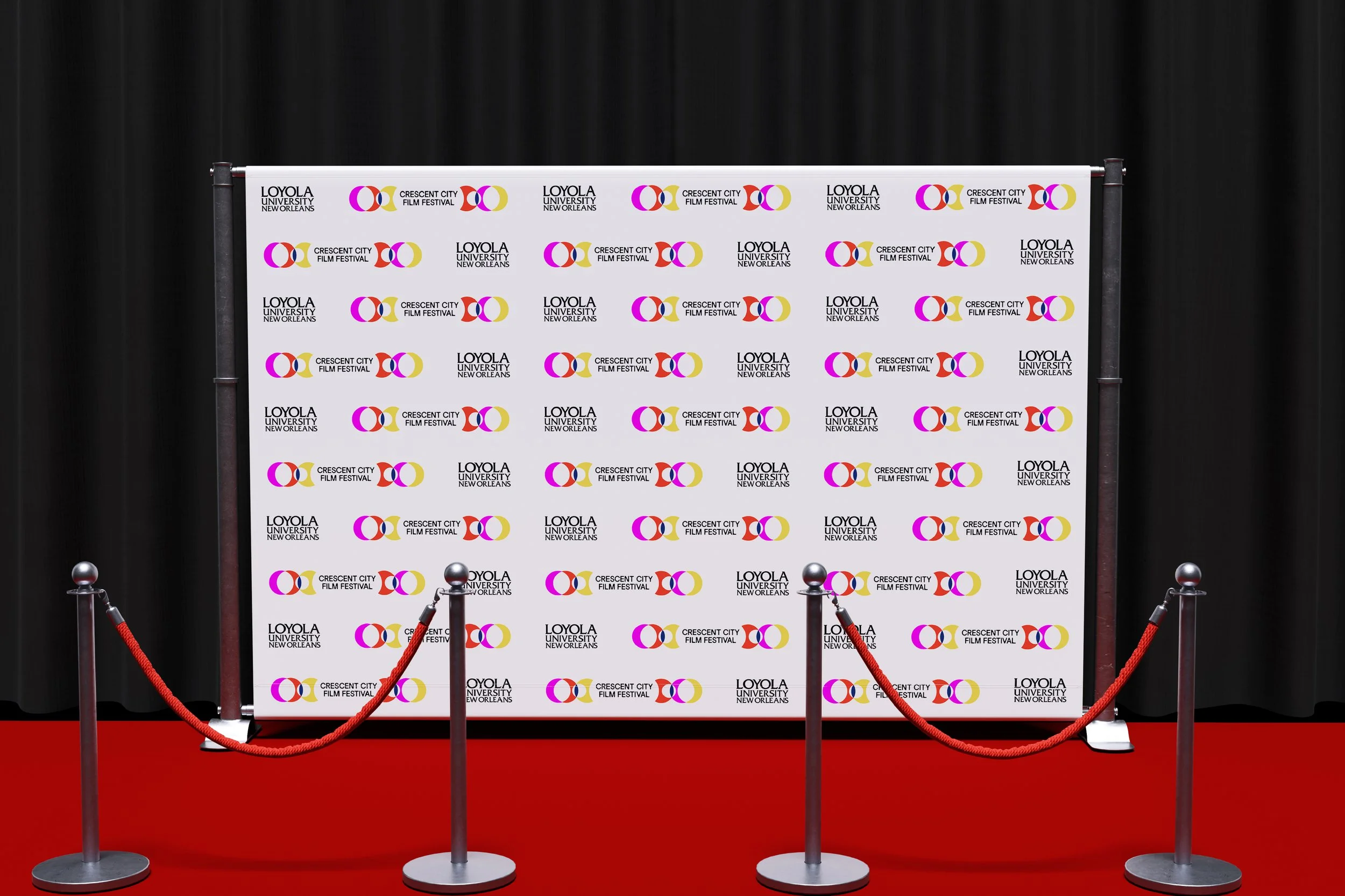
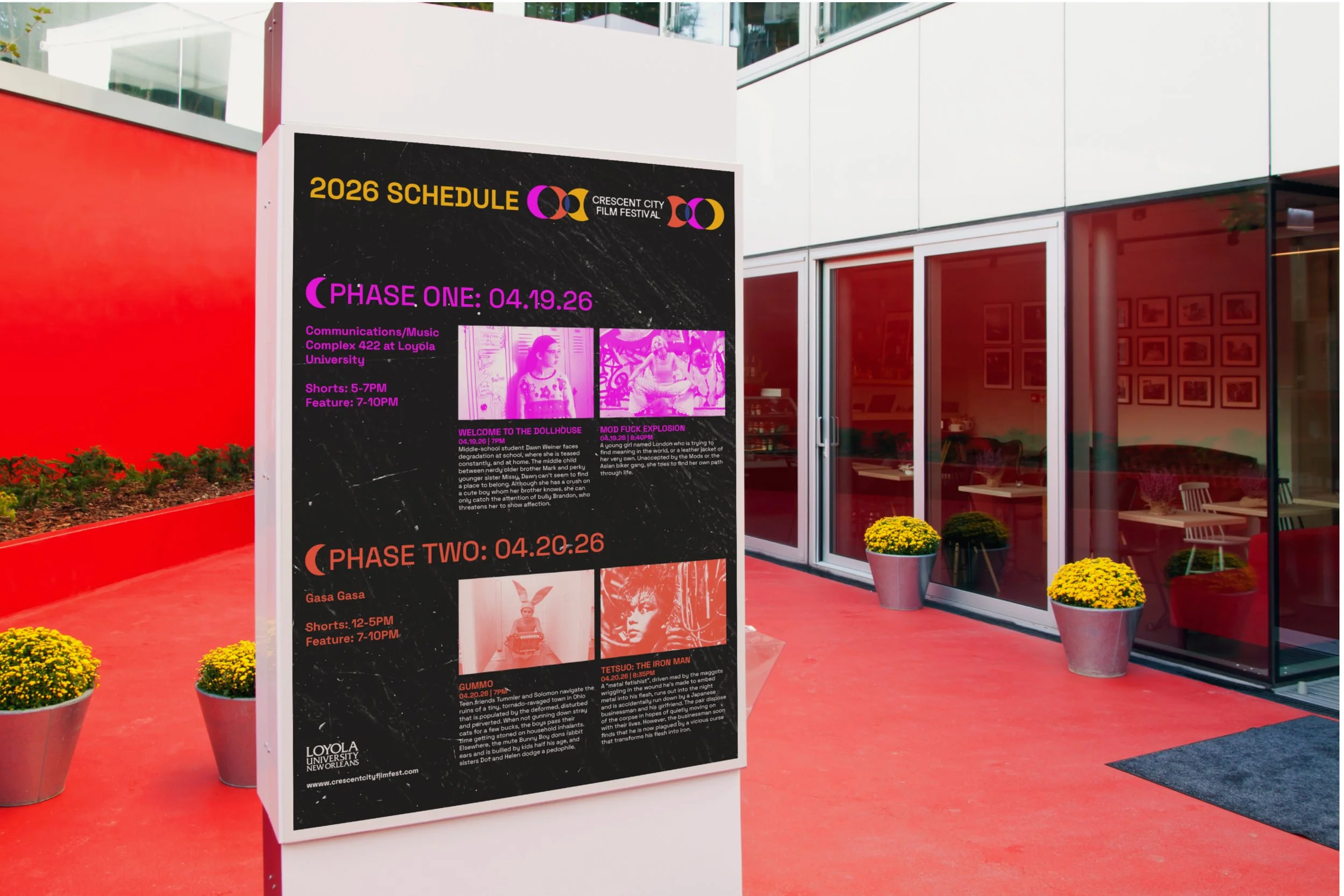
The new identity draws from the grit of New Orleans, lunar phases, and filmmaking itself to create a cohesive visual system. Applied across motion, print, and environmental design—from posters to red carpet backdrops—it elevates the festival into a more unified, professional, and widely recognizable brand.
UX DESIGN PRACTICUM
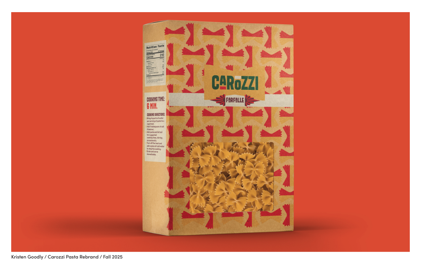
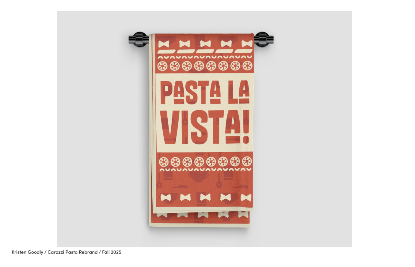
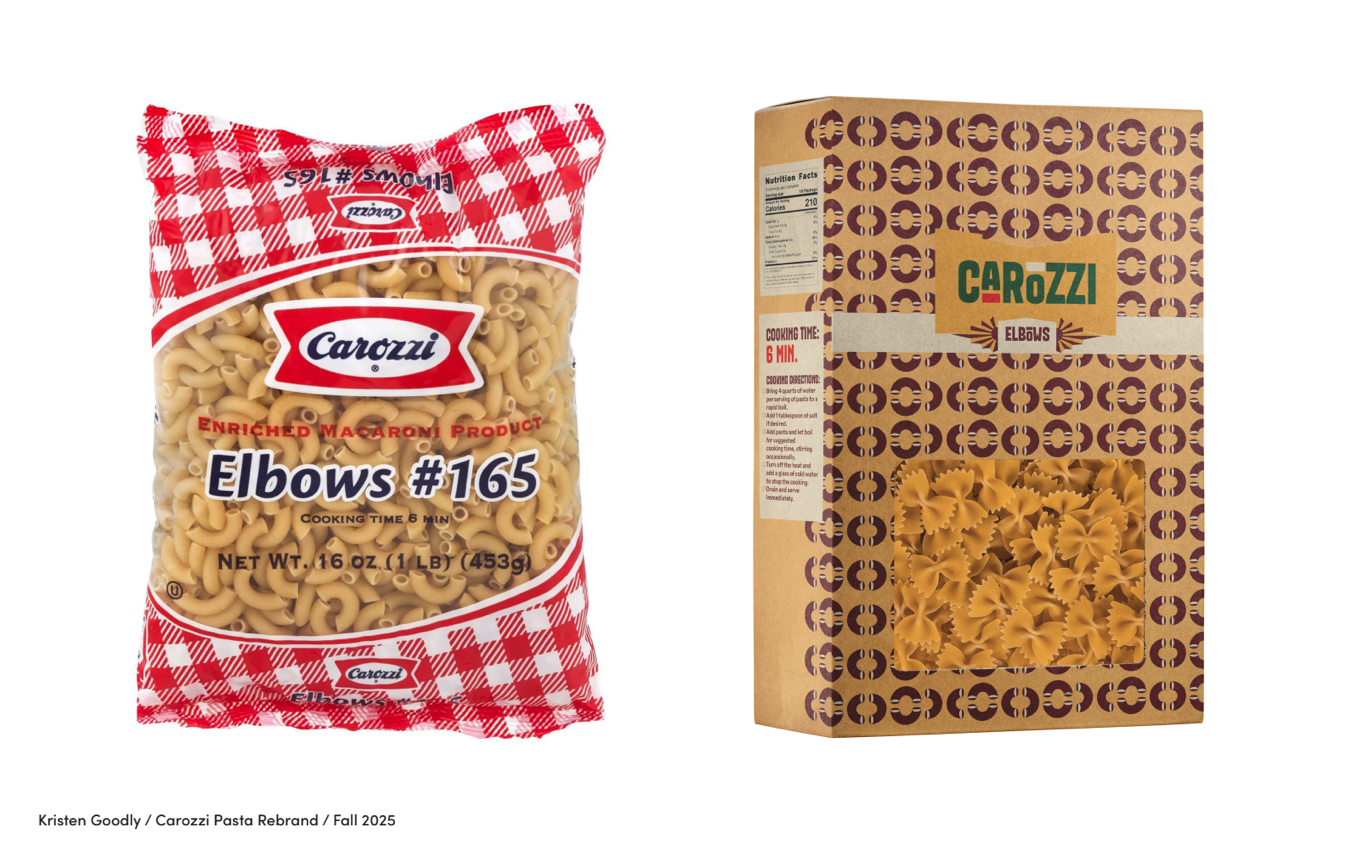
Project 1: Package Redesign
Brief: Reimagine an everyday product through research, iteration, and multi-touchpoint design, resulting in a cohesive brand system that engage new audiences across in-store and digital experiences.
Solution: Drawing from pasta’s Italian heritage, the rebrand incorporates a vintage aesthetic inspired by the brand's origins. The concept extends across product packaging as well as print and merchandise design.
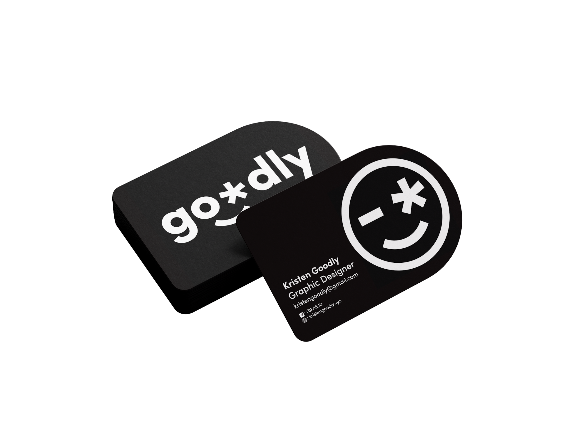
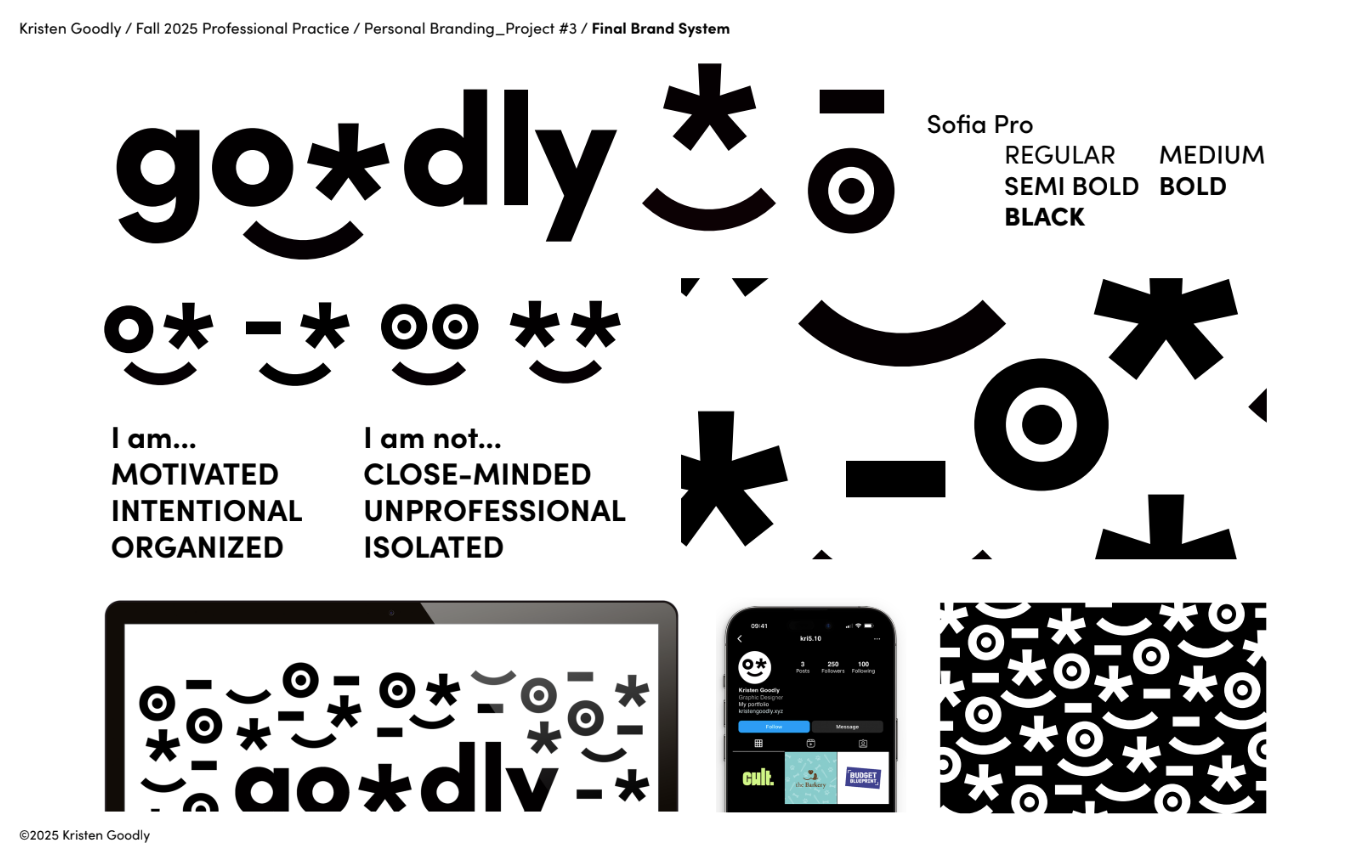
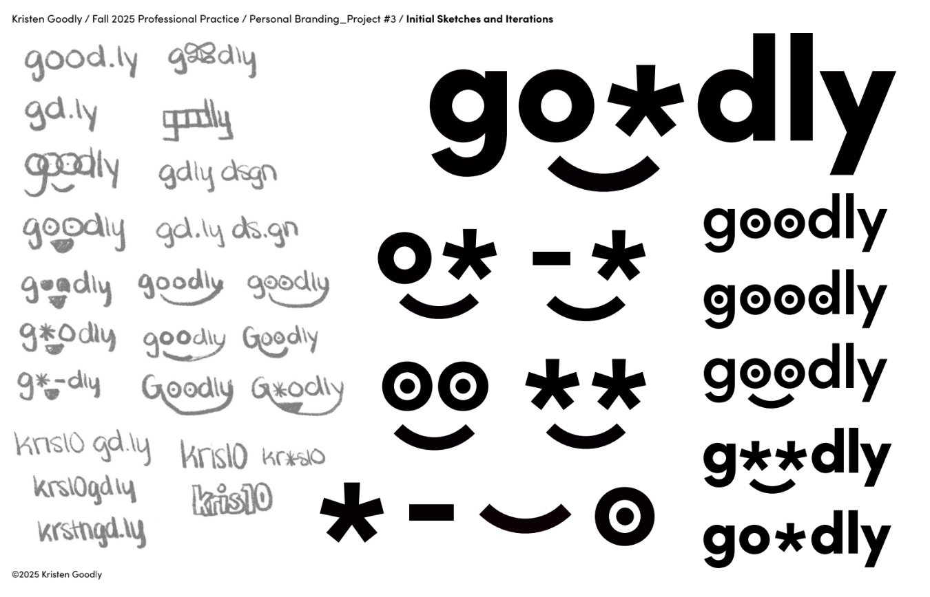
Project 2: Personal Branding
Brief: Design a distinctive personal brand through web portfolio design, business card, résumé, and a visual identity system that communicates your creative voice as a storyteller and maker.
Solution: Inspired by my last name, I developed a brand identity built around custom-designed emojis. To contrast my typically vibrant work, I used a minimal color palette, and created supporting brand assets and patterns to extend the identity.
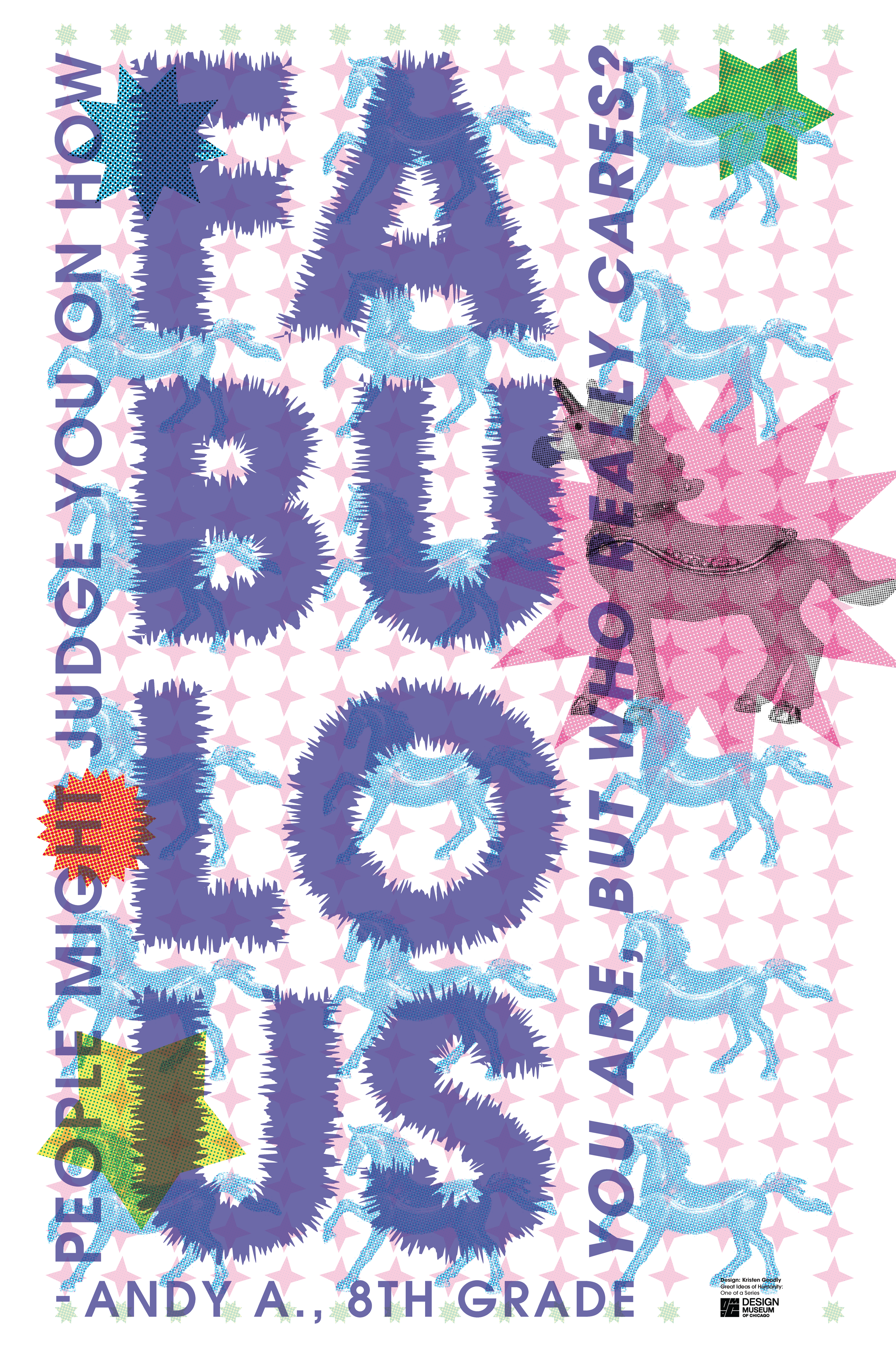
Project 3: Great Ideas of Humanity Loyno
Brief: Design a poster for The Design Museum of Chicago's "Great Ideas of Humanity" exhibition, which is a re-imagination of the Great Ideas of Western Men Series by the Container Corporation of America.
Solution: Use the "fabulous" imagery of a unicorn to create an elaborate poster design that also draws from the "childlike whimsy" of a middle school student.